An UX/UI Creative Design Example
This is my UI design proposal for UNFPA’s initiative to raise public awareness and mobilize private sector resources for maternal health interventions in fragile and humanitarian settings.
Key Features
a) Name of the campaign
‘The Safe Birth’ was the original name, but I have preferred to use ‘Save The Birth’ because I had thought this one included the suggestion to do something about it.
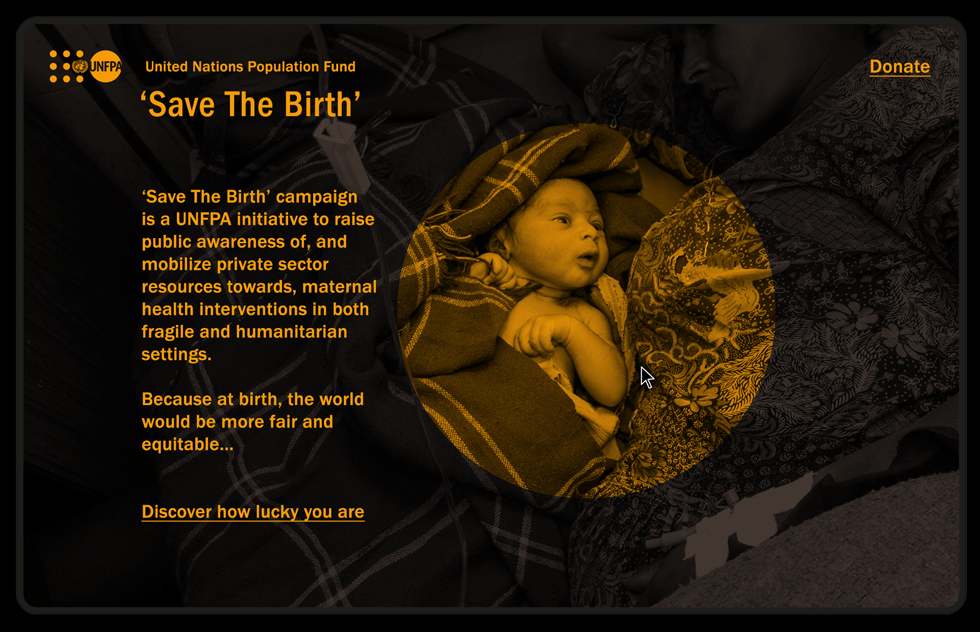
b) Visual and interactive idea
– A graphic composition with a circle as a point or a focus.
– This point is also a graphic item related to UNFPA brand.
– The user can play moving it with the cursor to discover the birth picture underneath…
→ It is a subtle way of saying that many times the problem is hidden and also an invitation to discover it.
c) Message
The spirit of the text avoids the drama of this reality and tries not to play with people’s feelings of guilt … Donations will come from a real need to cooperate, understanding that it is really possible to help.
Some questions guide the user to develop their thinking on the topic.
—————————————————————————————————————————————
SCREEN 1 : Introduction to the issue

—————————————————————————————————————————————
SCREEN 2 : Presentation of UNFPA campaign
—————————————————————————————————————————————
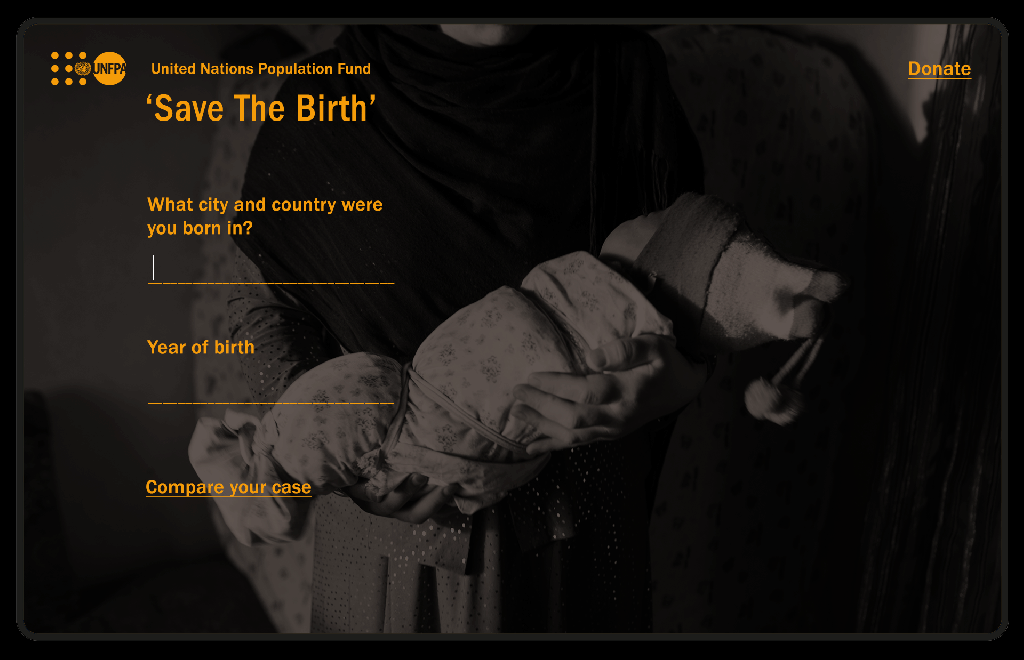
SCREEN 3 : App to compare the luck of being born in the good side of the world and create empathy with others.
—————————————————————————————————————————————
d) To finish the proposal
I imagine at least 2 pages more to take the proposal further:
- For donations, I need more information about the formulas created to make it very easy (safe delivery kit that saves lives and the salary of a midwife in the field).
- To communicate the transparency of the organization about resources and financing by taking the graphic information from this link: https://www.unfpa.org/funds-and-funding
THANK YOU : )
marieobelleiro@gmail.com
M. +34 677 30 20 18
← Back to www.marieobelleiro.com
